Typographic design
What fonts to use for the name of the game, and in it?

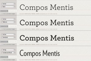
I *love* this Hoefler & Frere-Jones’ typeface, Archer. Look at that ‘C’!
What a lovely game name/heading Archer Book would make: gorgeously classic-yet-futuristic. With Verlag Condensed as a complementary contrast for in-game body text.


Leave a Reply
Want to join the discussion?Feel free to contribute!